Mitch Millsaps
Software designer based in Denver, CO.
Side projects

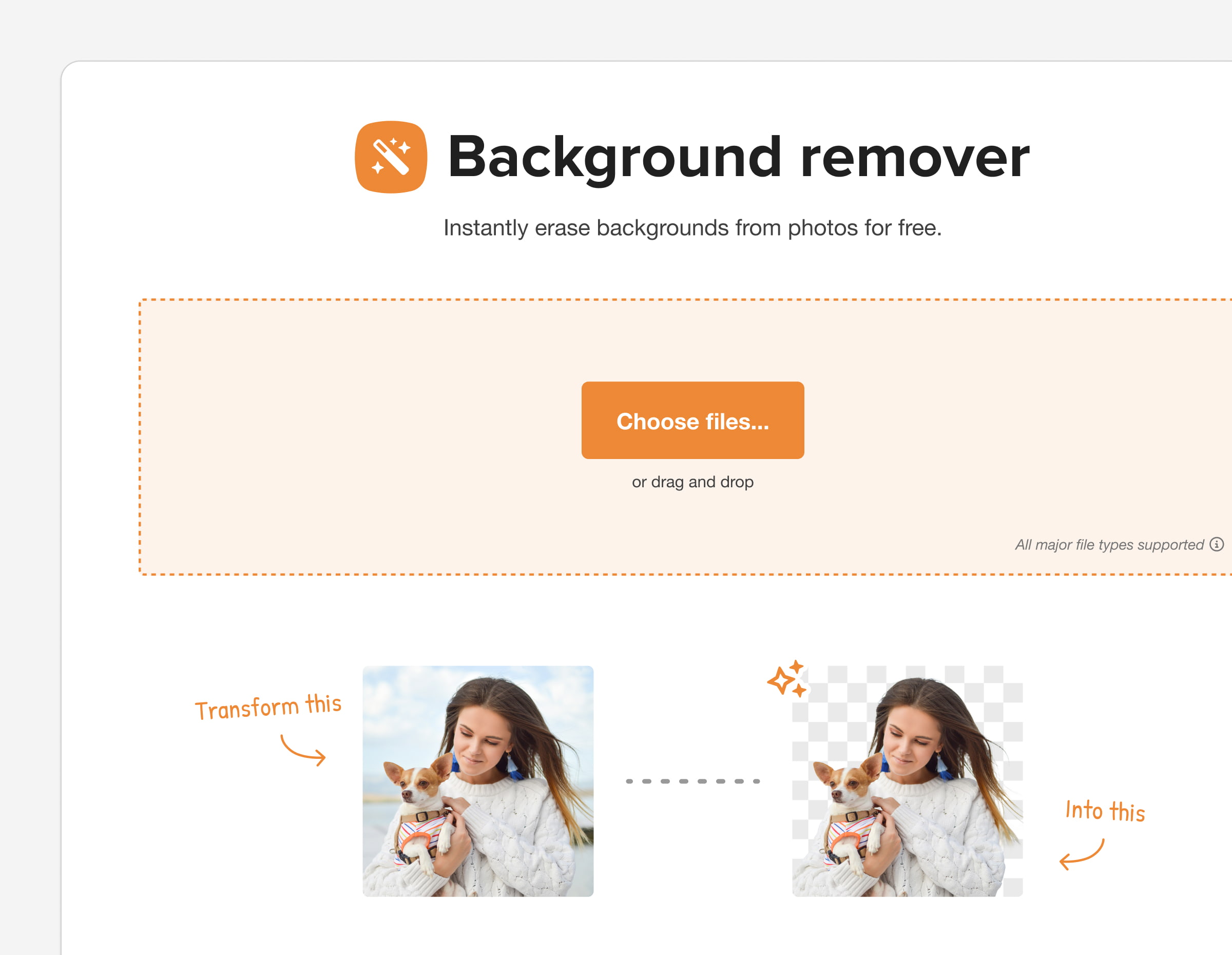
Trace was one of the first things I worked on Sticker Mule but I'm now finally happy with its look and functionality. This is part of a larger effort to standardize our UX and style across tools to make them beautifully simple and easy to use. Also comes with some new features to integrate with our online design tool and help train the AI model.


I got to refresh the look and UX of our image upscaling tool as part of larger effort to standardize UX across our tools. Really happy with how much I was able to simplify with this one from the first iteration.


An unused concept for the Stimulus home page but it was fun to play around with the style


Got to design a fun landing page for an event we're throwing

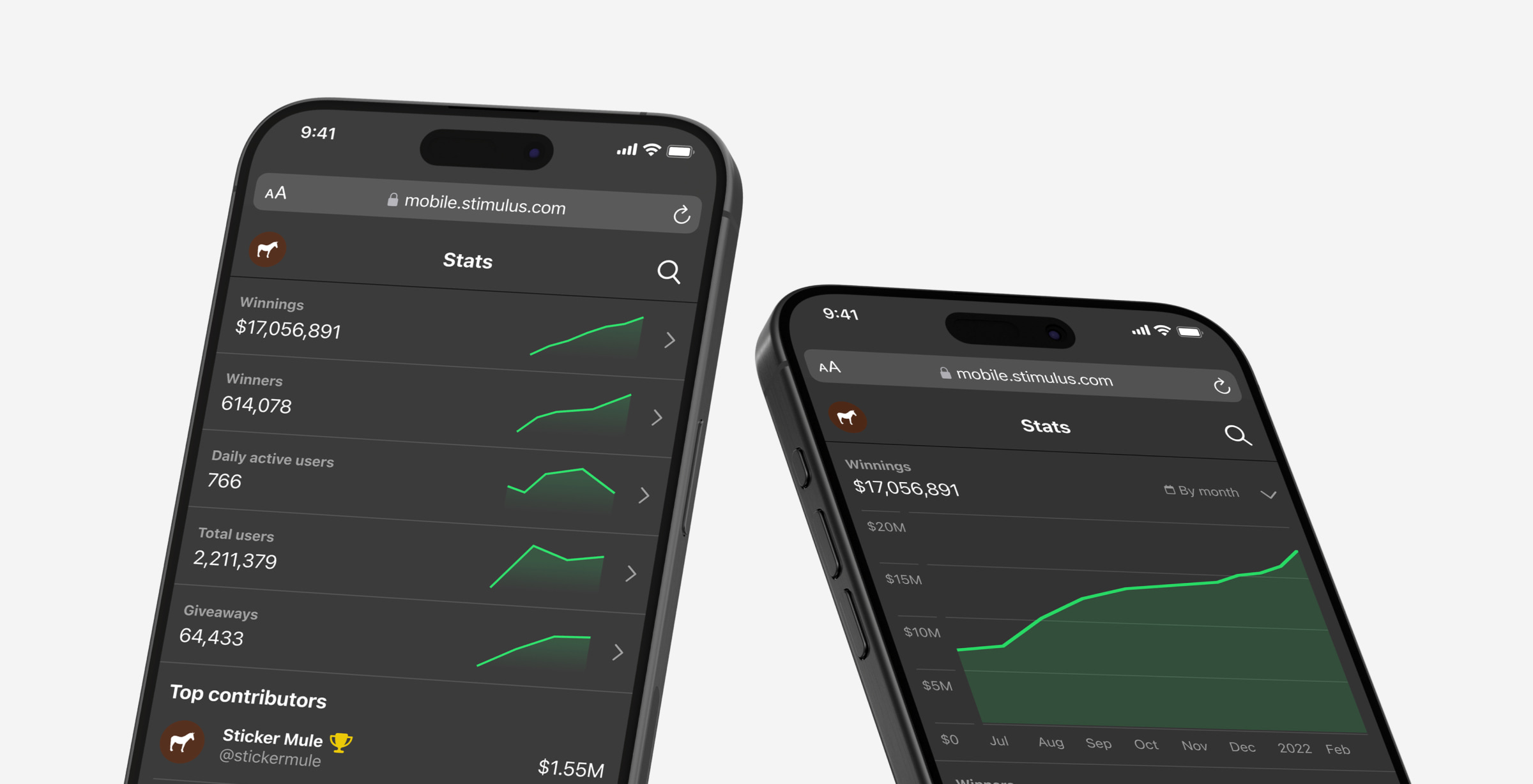
Quick preview of our random side social media project's public stats page.

Some fun illustrations for various states around the Stimulus site for giveaways, shopping, and account management.

Some icons from a series I'm making for random spots around Sticker Mule

Fun idea I had for an app where you log the games you play and get the communal review aspect. Making the icons for this was fun and I thought the PS2 memory card for logging a new game was pretty clever.

My final post for Calendly. I'll be going somewhere new soon but figured I'd share a preview of the shared library I made to keep us on track across teams.

Some stickers I illustrated for Calendly's meeting rooms. All 4 are named after cocktails: Mojito, Moscow Mule, Mai Tai, Manhattan

Had the chance to design the new onboarding experience for Calendly. It's been live for a while now and we've seen a huge uptick in first time meetings scheduled — one of our primary success metrics.
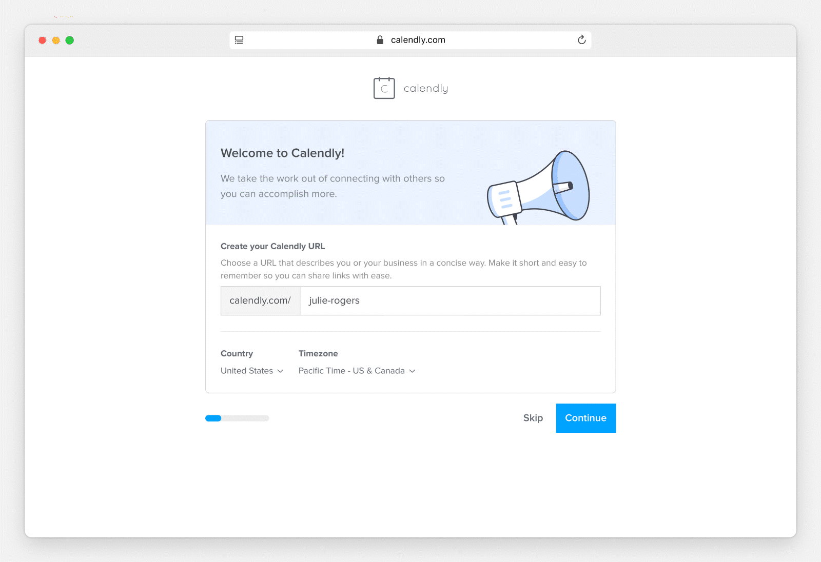
This was an awesome validation of the original hypothesis — the existing onboarding being barebones and disconnected. We've been speaking with customers a lot more lately and the research insights we've gained made this the best it could be.
Couple of illustrations for Calendly's newsletter emails. Really like the metaphor for time management.


Updated the Calendly pricing page now that we have a new plan and tons of new features.